I'm not on Twitter, and don't follow anyone on twitter other than what ends up in wider social and media circles. But I'm not a luddite - I'm an engineer and technophile - so I am not immune to Twitter usefulness and impact on the world. So I read with interest a blog post from the Smithsonian, reporting on research done by The Global Twitter Heartbeat project out of the University of Illinois. They took the geographic information from millions of tweets and graphed it on a map:

Which looks impressively like the global distribution of electric lights:
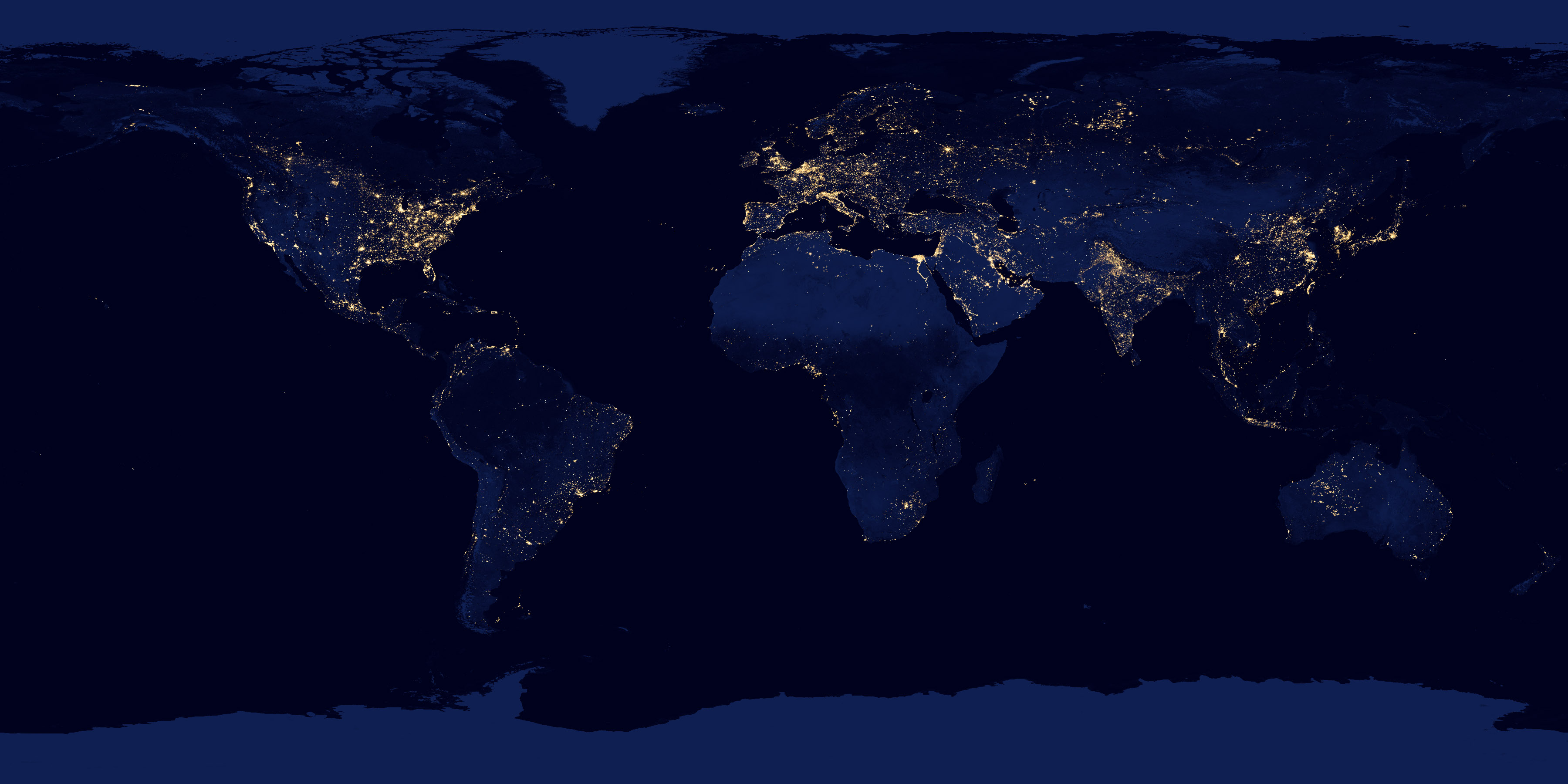
But they went further and looked at the where is, and more importantly, where there isn't overlap. For instance, the maps show places that don't have widespread electrification, but a decent amount of twitter traffic (e.g., the Amazon). Conversely, places that have electrification but very little twitter traffic (e.g., Iran, where twitter is banned).
There is also geographic analysis of what language gets used where. So, for instance, they found that, unsurprisingly, that a country's native language is also the most likely to be used for tweets from that country. However, they could also find where, for instance, there were heavy infusions of Spanish-language tweets from within the U.S.
Good data visualization is something I greatly enjoy. These guys have done a neat job with it. I urge you all to have a look.
Friday, May 10, 2013
Tweet Map
![]()
Subscribe to:
Post Comments (Atom)
No comments:
Post a Comment